ProteoGenix: Homepage Redesign
Client
ProteoGenix, Life Science Company (B2B)
Scope
Responsive Homepage Redesign, 2025
Role
Sole UX/UI Designer
Clarifying the B2B journey: A homepage transformation
I led the redesign of a content-heavy B2B homepage to create a clearer and more trustworthy user experience. The project involved working within an existing WordPress setup while aligning multiple stakeholder perspectives into a consistent direction.
Focus: Turning complex content into an intuitive experience that improves usability and supports conversion
Disclaimer: Some details have been generalized, and the live website has evolved since the redesign and may not fully reflect my work.
My Approach
Aligning direction early
After the initial brief, I planned and facilitated a UX/UI workshop to align stakeholders on:
what the homepage should achieve
who it needs to serve
which content actually matters
This helped shift the conversation from “what do we show” to
👉 “what do users need first?”
The outcome was a clear focus on:
guiding users to services
building trust early
supporting conversion into contact and shop flows
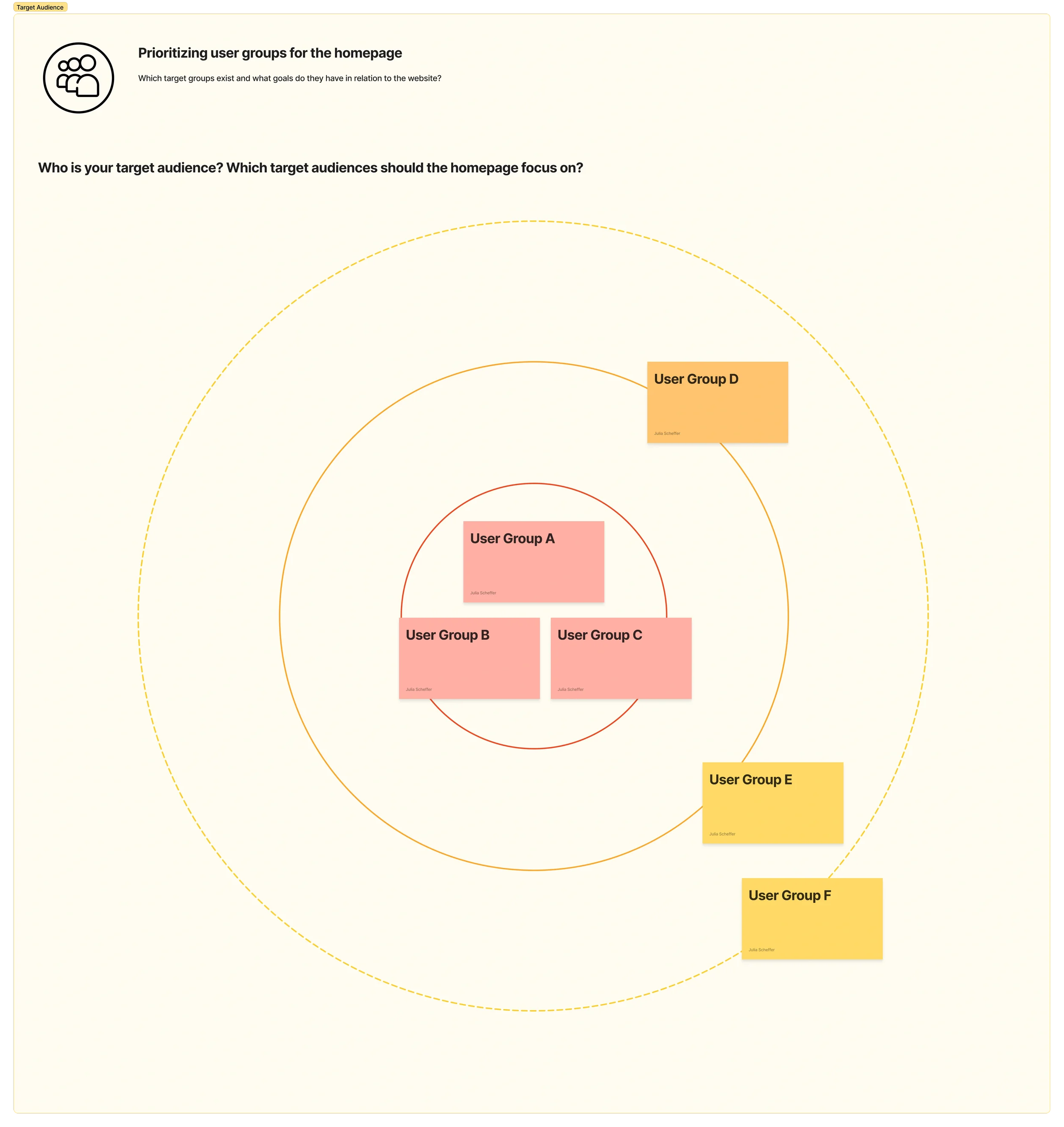
User groups were mapped and prioritized based on relevance to homepage goals. Key content and visitor goals were defined for each group, helping to structure the page and guide users toward relevant actions.
Creating structure instead of decoration
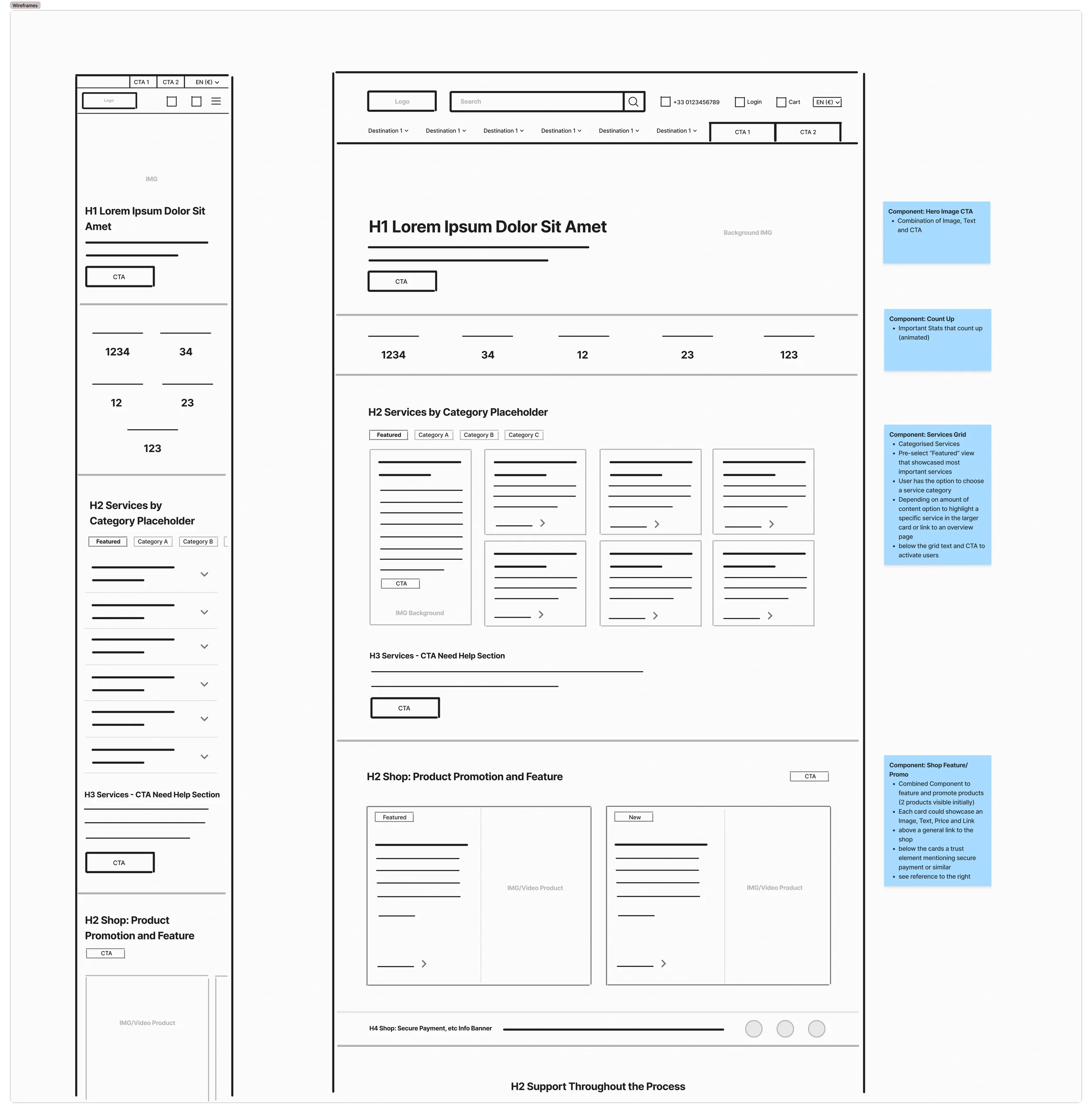
Rather than layering visuals on top, I reworked the page from a structural level.
The homepage was reorganized into modular sections that guide users step by step: from understanding → to exploring → to taking action. This reduced cognitive load and made the experience feel more intentional.
Designing within constraints
The redesign had to stay compatible with an existing WordPress system and match the rest of the site. Instead of fighting that, I leaned into it by creating a flexible component system with clear rules — so the design would still hold up even when content is edited later on.
Key Design Decisions
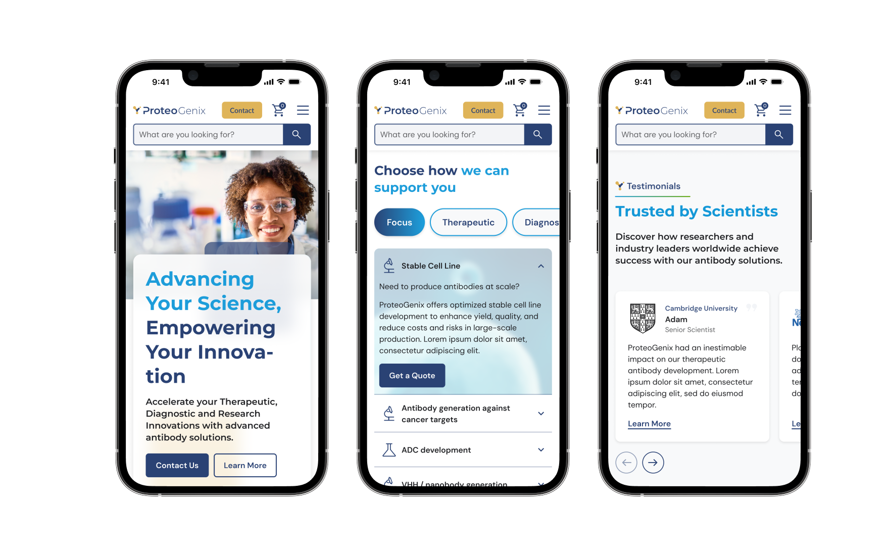
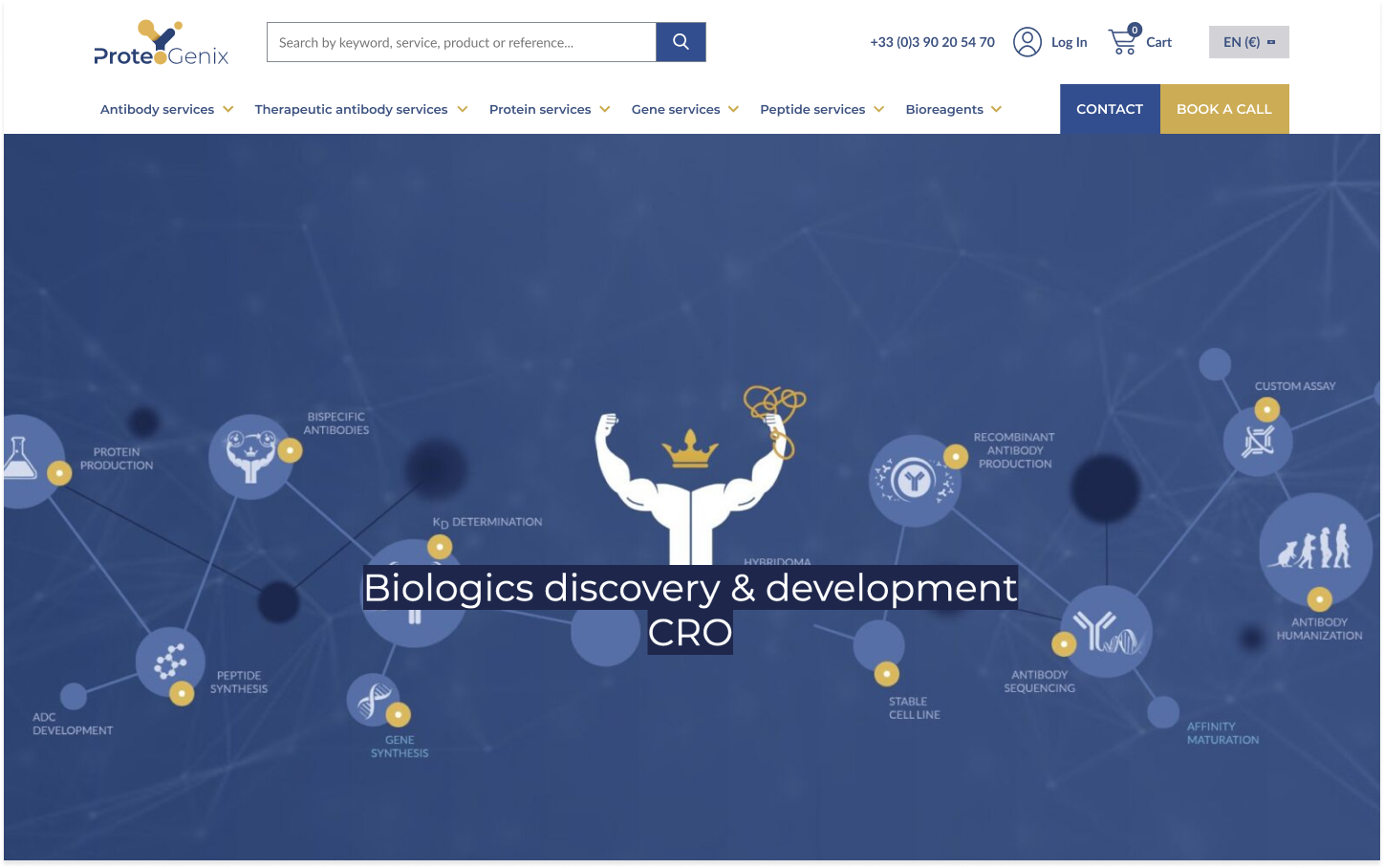
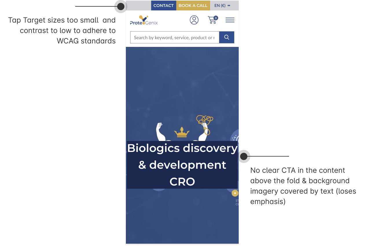
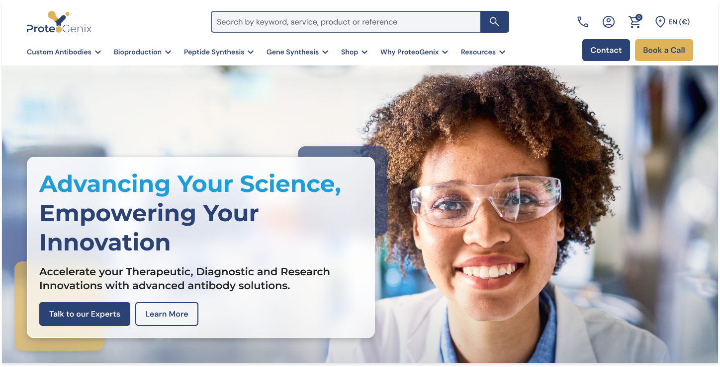
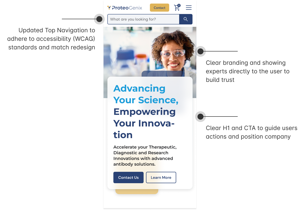
Header: first impression & direction
The original homepage lacked a clear starting point.
I redesigned the hero to immediately communicate expertise while guiding users toward a primary action. The focus was on increasing clarity by reducing visual noise and making the next step obvious.
Previous Version
Redesign Header
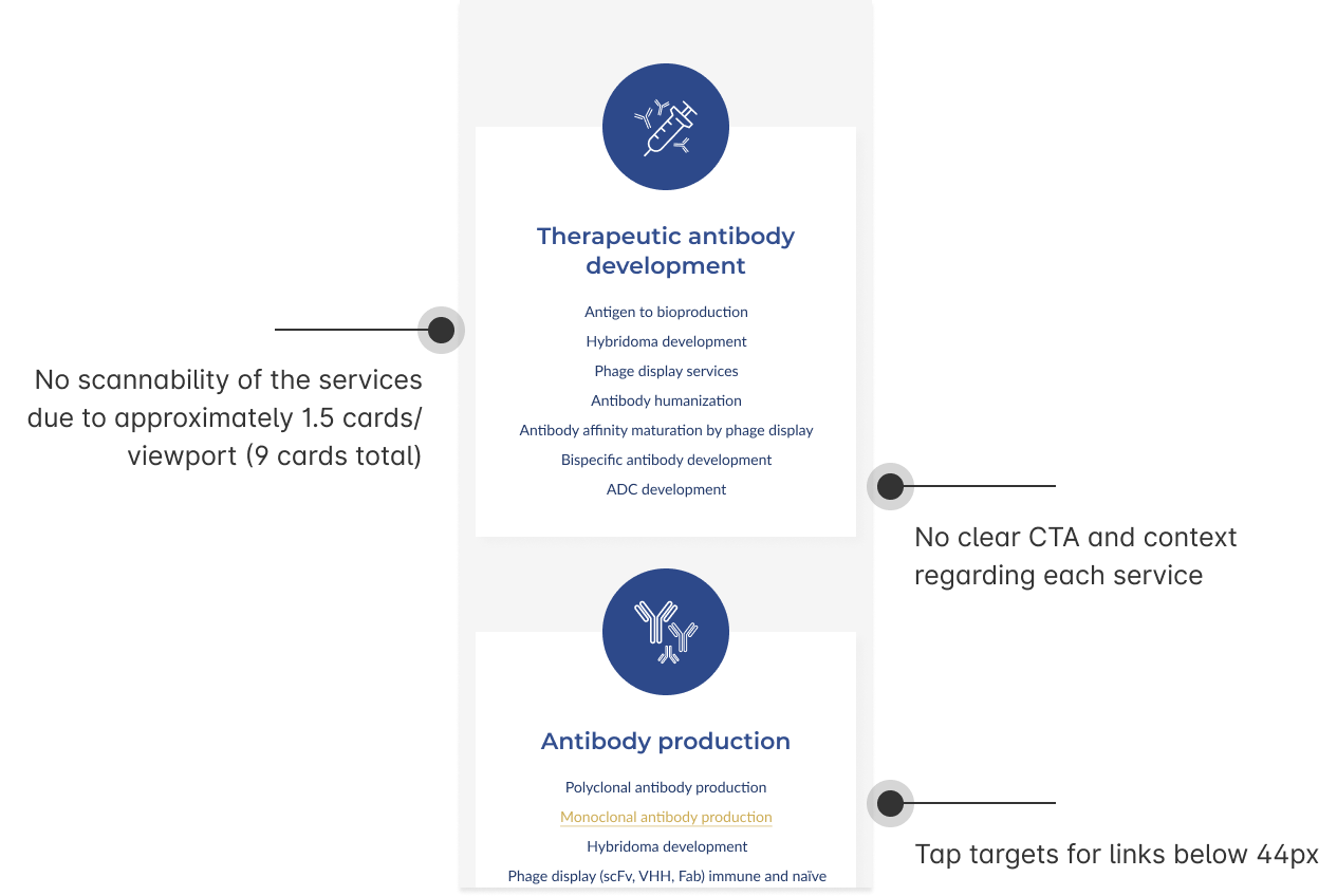
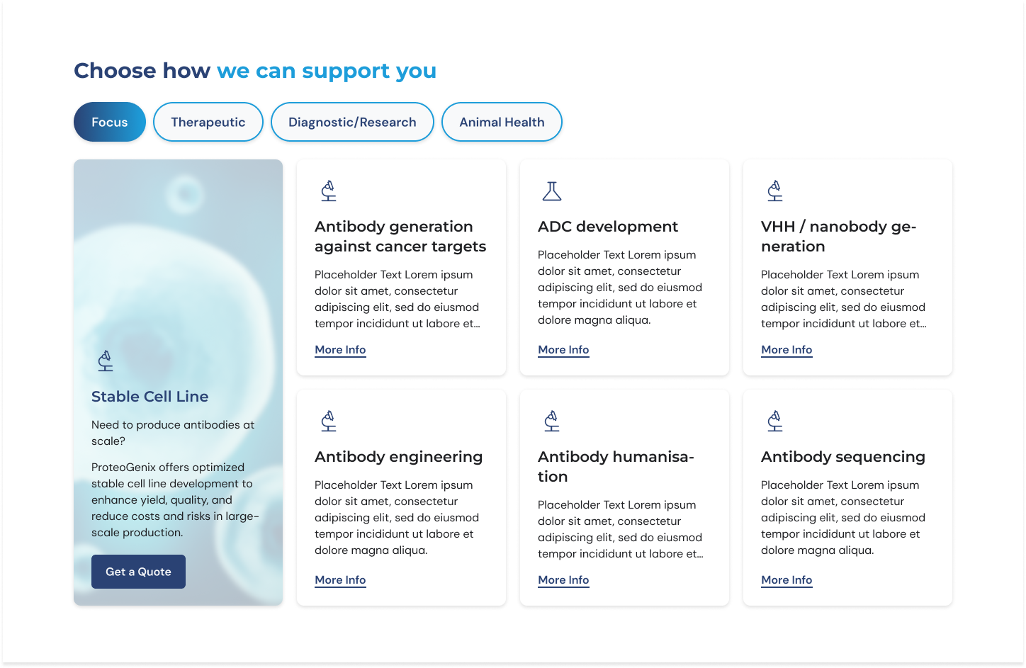
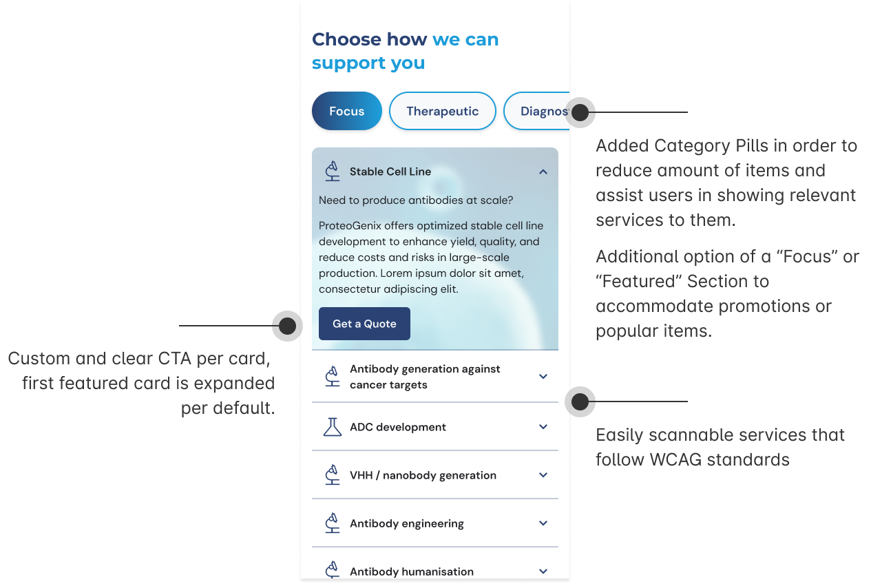
Services: making complexity scannable
The service offering was broad but difficult to navigate.
I introduced a structured card system combined with tabs to organize content into digestible groups. This allows users to quickly scan, compare, and find relevant services without feeling overwhelmed.
Previous Version
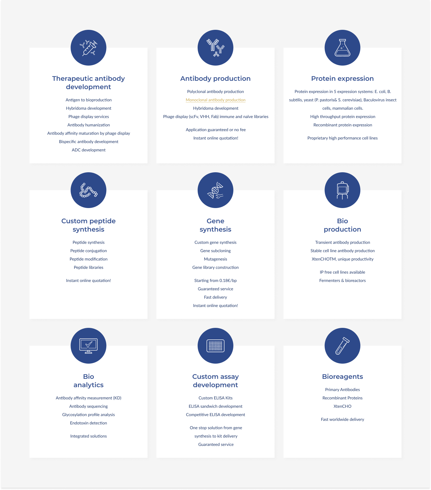
Redesign Services
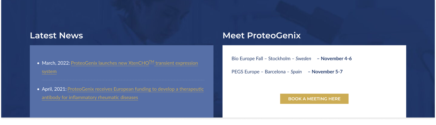
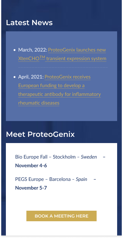
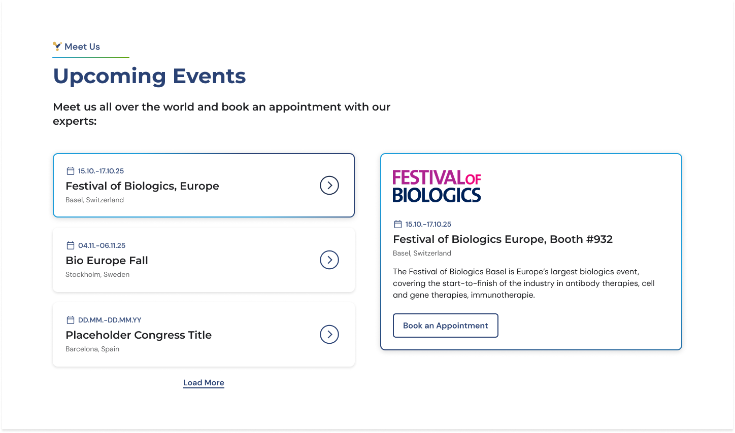
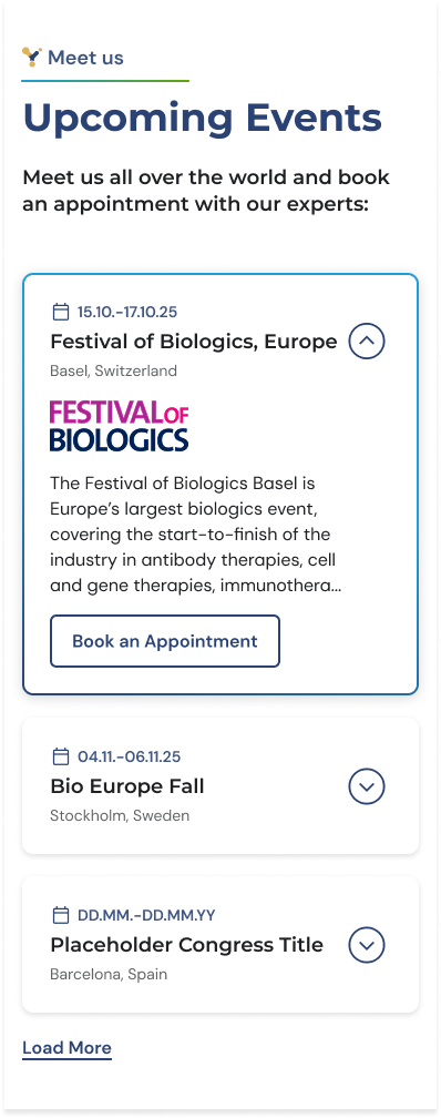
Events:
supporting engagement & trust
Events were previously hard to find and visually inconsistent.
I redesigned this section to feel more structured and accessible, turning it into a clear touchpoint for engagement. It now supports both discovery and credibility by showcasing ongoing activity. Additionally “Latest News” is displayed in its own dedicated section enabling the client to display a variety of articles with additional info such as images, meta data and CTA.
Previous Version
Redesign Events
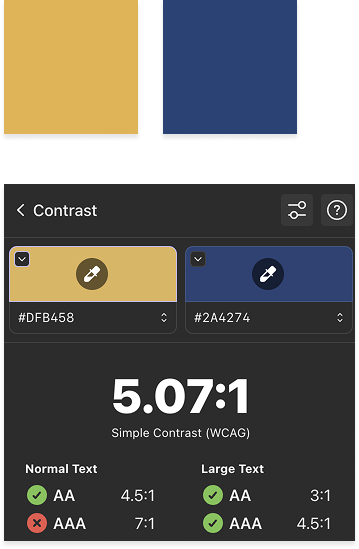
Accessibility & visual system
Accessibility became a core part of the redesign, not an afterthought.
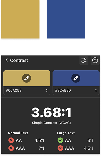
I refined the existing brand colors to meet WCAG AA contrast standards and defined clear usage rules — especially for accent colors like yellow, which were previously overused. With the redesign yellow is no longer used on white backgrounds and only on the dark blue background. Both colors have been modified slightly to ensure the needed contrast levels.
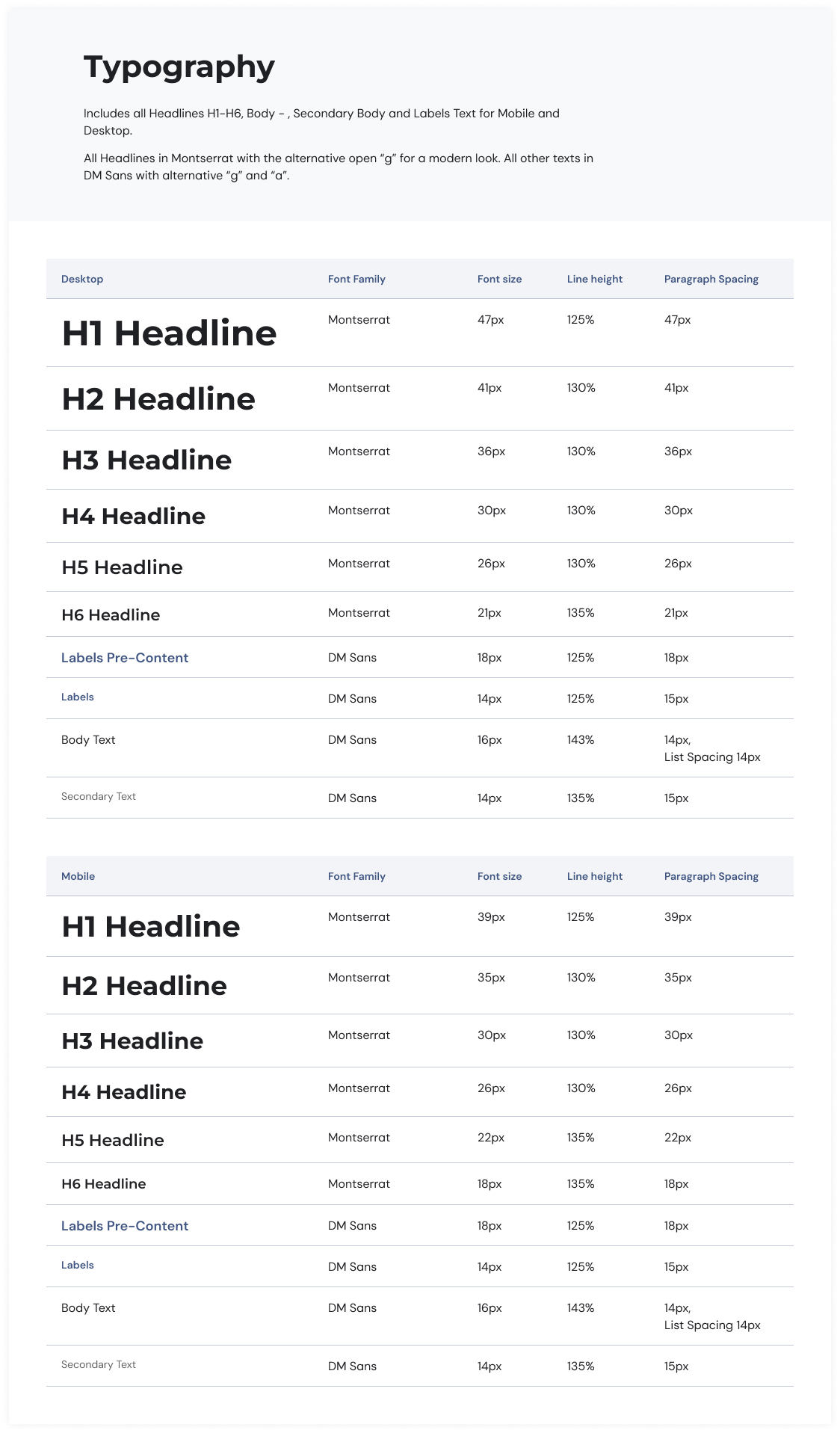
Typography was updated to improve readability in a content-heavy environment:
Montserrat for clear, modern headlines
DM Sans for accessible body text
Typography
Previous Accent Colors
Updated Accent Colors
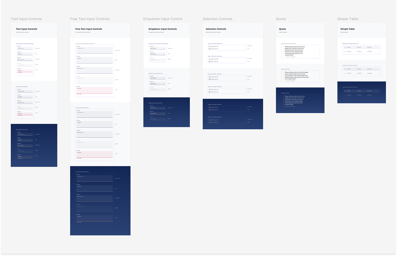
Scalable system & mobile usability
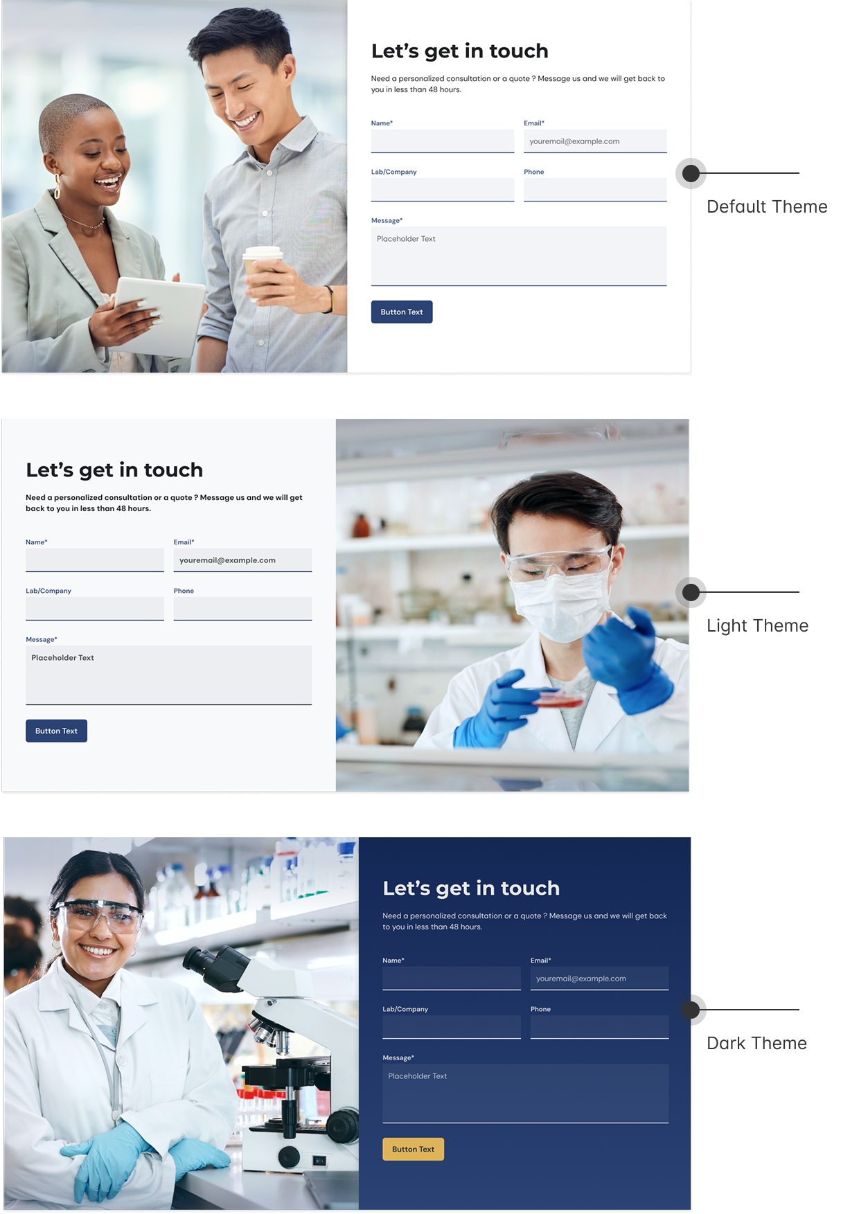
To make the design scalable and adaptable, I created a flexible component system with three themes: a light default, a subtle accent version, and a dark variant. This allows for visual variety while maintaining consistency, which is especially important in a CMS where content changes frequently.
At the same time, I improved the mobile experience and accessibility by refining spacing, tap targets, and layout behavior, ensuring the interface remains clear and usable across devices.
Design System Excerpt
Theme Example: Contact Form
Outcome
The redesign resulted in a clearer, more structured homepage that:
guides users more effectively
improves readability and accessibility
creates a stronger first impression
It also introduced a system that enables the team to manage and scale content more consistently.
Reflection
This project pushed me to balance user needs, business goals, and technical constraints — independently.
If I continued working on this, I would validate decisions through usability testing
and further simplify content based on real user behavior.
Disclaimer: Some details have been generalized, and the live website has evolved since the redesign.
Let’s work together
If you're looking for a UX/UI designer who brings structure to complex problems, I’d love to hear about your project.