Flynt Redesign: Branding, Website & Design System
Client
Bleech GmbH (Agency)
Scope
Branding, Website Redesign, Design System, 2024-2025
Role
Lead UX/UI Designer
Designing a scalable foundation for modern WordPress projects
Refreshing the Flynt brand, website, and design system to improve scalability, accessibility, and developer workflows.
I led the redesign of Flynt, an open-source WordPress theme used as the foundation for agency and community projects. The goal was to modernize the visual identity, improve usability, and create a scalable design system that balances simplicity, accessibility, and developer efficiency.
The project included:
a refreshed brand identity incl. illustrations
a redesigned Flynt website
and the Figma design kit built for real-world production workflows
Disclaimer: Some details have been generalized, and the live website has evolved since the redesign and may not fully reflect my work.

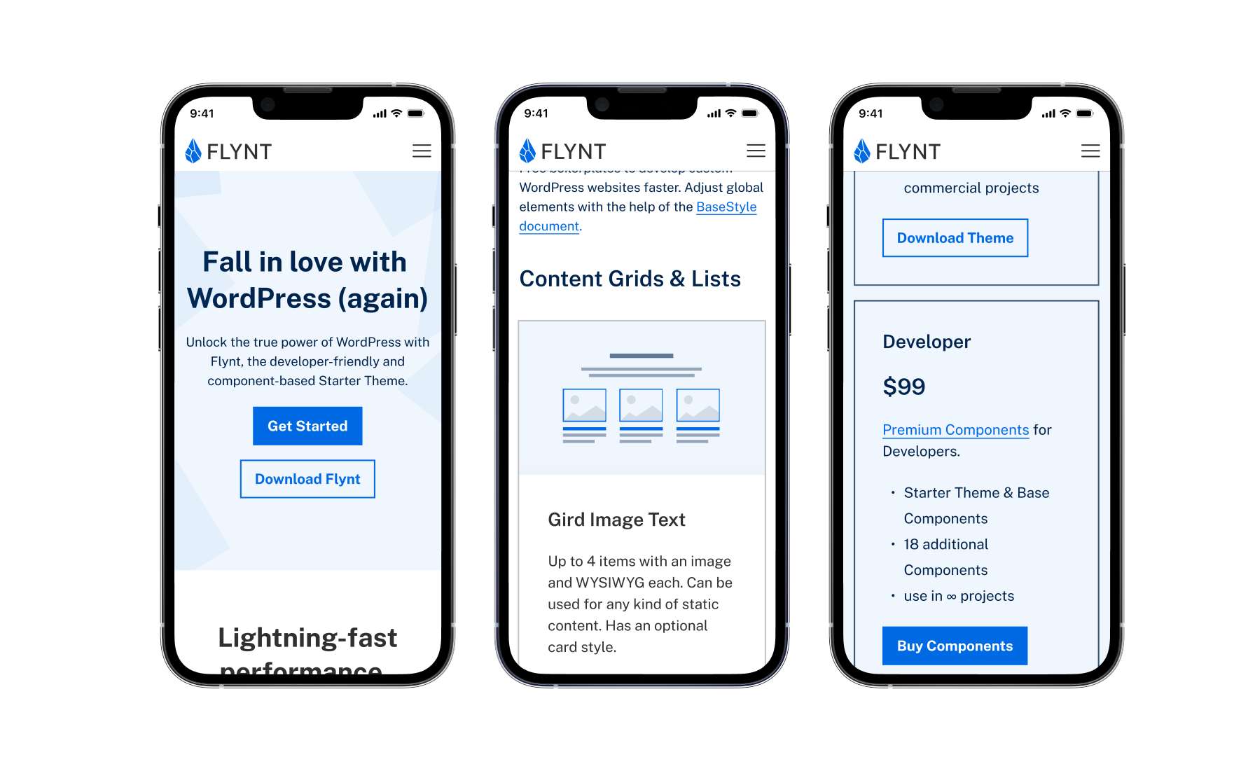
Brand, Logo & Website
Before the redesign, Flynt relied on muted green tones and Montserrat typography. The visual identity felt outdated and lacked the clarity and modernity expected from a developer-focused product.
I redesigned the branding around a stronger and more confident visual language:
a bold primary blue
Public Sans as the core typeface
simplified layouts with a stronger focus on readability and structure
The Flynt website itself was rebuilt using the new base style, allowing the system to demonstrate its own flexibility and real-world application.
The overall direction focused on creating a modern, clean, and highly functional experience tailored to developers and technical teams.
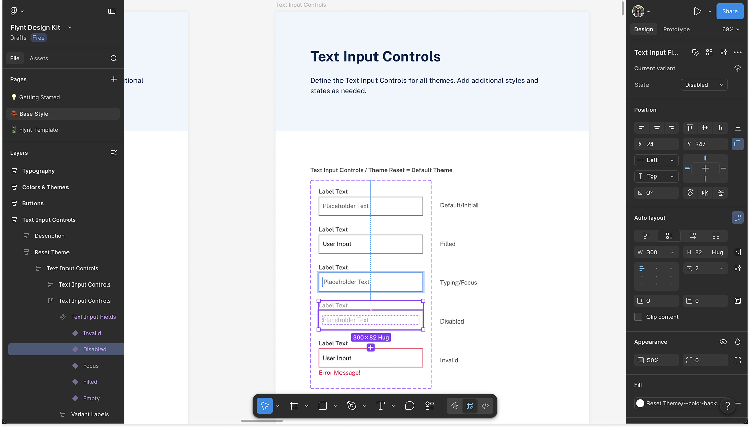
The Design Kit
The core of the project was the creation of a lean but flexible design kit in Figma.
Unlike traditional enterprise design systems, the goal was not to create endless component variations. Instead, the focus was on simplicity, scalability, and production efficiency. This simplified structure also helps developers move quickly without sacrificing consistency or usability.
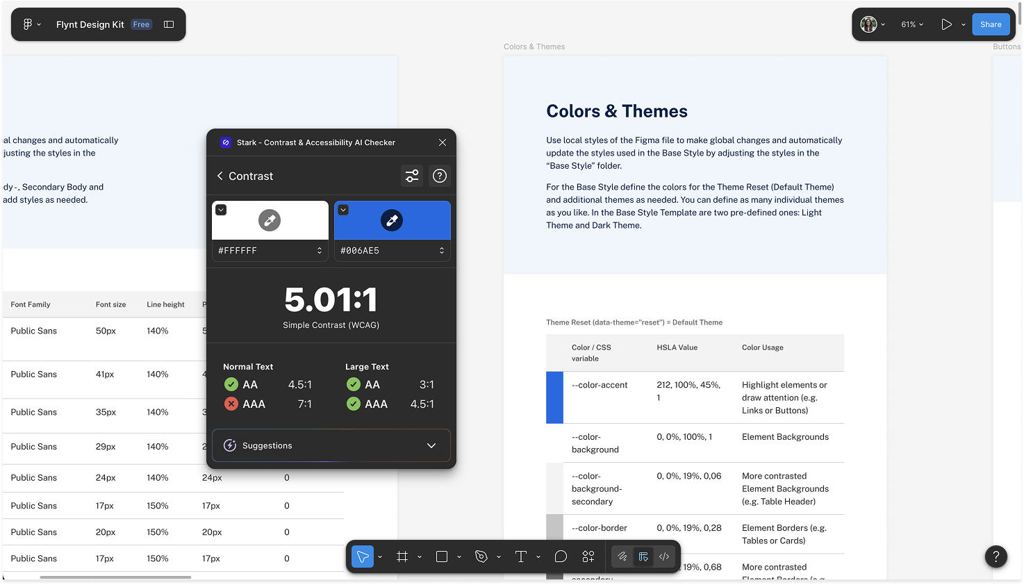
Every component was designed with accessibility standards (WCAG level AA), clean implementation and performance-conscious design decisions in mind.
WCAG accessibility standards played a central role throughout the process, influencing: contrast ratios, typography sizing, spacing and interactive element behavior.
To date, the design kit has been used by over 570 designers and developers in Figma.
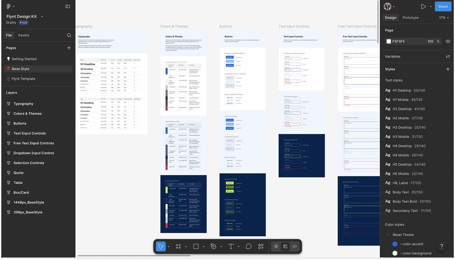
The system includes: typography, color themes, buttons, different types of input fields and selection controls as well as tables and cards with reusable UI foundations across three themes.
Designing for Developers
A major part of the challenge was balancing visual quality with technical feasibility.
Because Flynt is built for real-world production use, every design decision had to support easily maintainable code, scalability and performance optimized implementation.
Rather than creating purely conceptual UI, I focused on purposeful design solutions that work within development realities while still delivering a polished user experience.
This close collaboration between design and development became one of the project’s biggest strengths.
Accessibility & Performance
Flynt is heavily optimized for performance and accessibility out of the box.
The design system was intentionally kept lightweight and structured to support:
fast loading times
clear visual hierarchy
responsive behavior
and accessible interaction patterns
This approach reinforced the idea that good UX is not only visual — it also includes performance, clarity, and usability across devices.
Impact & Reflection
This project strengthened my ability to think systematically across branding, UX/UI design, accessibility, and developer workflows at the same time.
It also reinforced my belief that strong design systems should simplify complexity rather than add to it.
By combining structure, scalability, and purposeful design decisions, Flynt became a flexible foundation that supports both agency work and the broader open-source community.
Let’s work together
If you're looking for a UX/UI designer who brings structure to complex problems, I’d love to hear about your project.